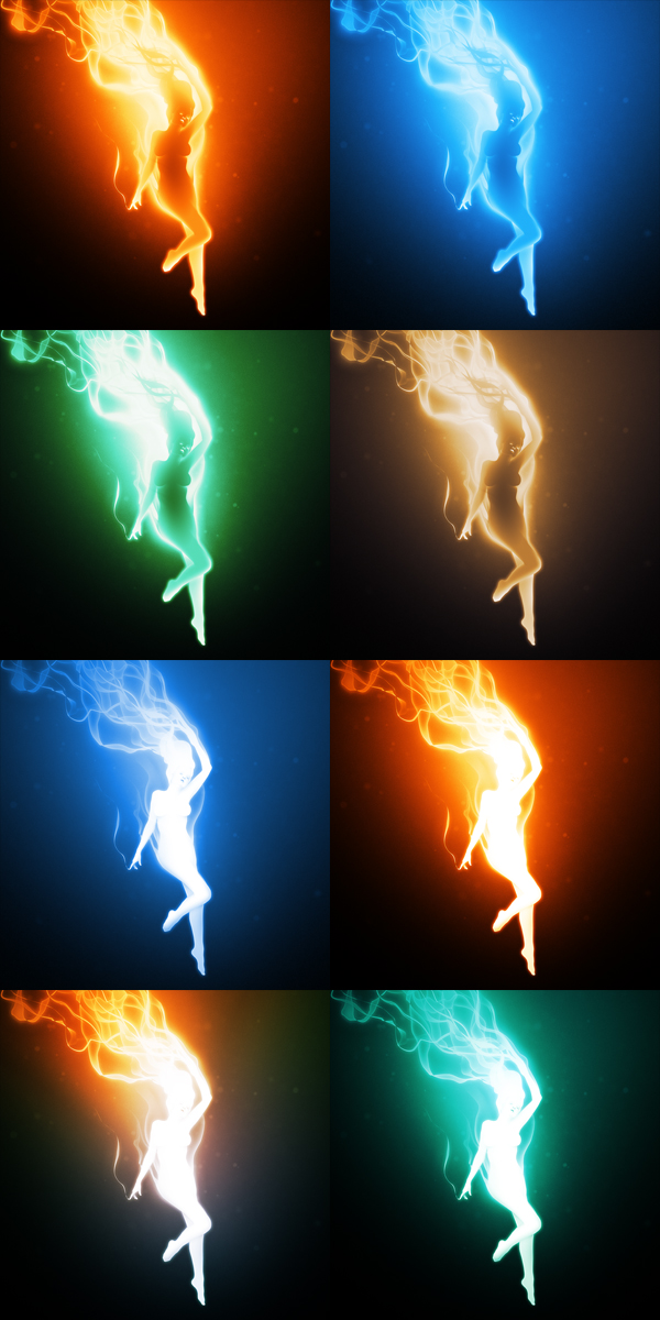
Light & Magic, alternate colors
 Art,
Art,  Randomness
 As I mentioned in the previous post, Light & Magic was one those paintings where I had a difficult time deciding on a final color scheme (in the end I decided on the blue underwater look I posted here on the site and the fiery one in the top left corner of the image above - which is available on DeviantArt).
Usually when I make a painting I work in grayscale so that I don't let colors distract or influence me into different directions. I know a lot of other artists out there are probably against working this way and would prefer to let color guide them through the artistic process, but I usually find it too time consuming and distracting.
Working in grayscale is more like painting with light, as all I really worry about is shading and highlighting. Once I am happy with the overall tone and lighting in a painting is when I will typically begin to experiment with adding in color. Most of the time I will set up a matrix like the image above and I will make dozens of color alternates before slowly narrowing my choices down to a winner.
 Sat, April 7, 2012 at 11:55 PM


